emory-background

Containers

This is Rich Text component added inside Container component.

Example Content


At Emory Healthcare, our core purpose is to improve lives and provide hope. This purpose extends beyond the walls of our hospitals and clinics. It reaches into our communities, where nearly 24,000 Emory Healthcare employees live their daily lives as your neighbors. We realize that the environment, the economy, education, public safety, and justice all play a role in community health and well-being.

Container with Yellow Border option

Vitae ad adipiscing enim a is elit a a dignissim ante suspendisse pretium a congue curae vitae conubia ac magnis vestibulum nibh. Sem in consectetur erat eget accumsan quisque scelerisque a neque phasellus habitant erat nibh iaculis platea aliquam a ultricies augue quisque urna commodo imperdiet etiam hendrerit. Suspendisse dolor metus auctor massa vitae ut diam elit nunc sapien hendrerit ut ut hac curae a adipiscing nisl aenean nunc volutpat scelerisque.

Vestibulum a parturient parturient et urna eu sagittis id eros augue purus eu fermentum ad hac nisl hendrerit id adipiscing phasellus mi facilisi euismod condimentum purus natoque iaculis mi. Sed nisl quis scelerisque purus fringilla eros fusce parturient etiam vestibulum id ultrices ullamcorper nec vestibulum mi massa adipiscing in porta euismod urna. A vestibulum duis risus in inceptos libero cubilia vestibulum euismod porta ad pulvinar sit nec elementum scelerisque. Rhoncus pulvinar condimentum mattis habitasse ante volutpat vestibulum diam facilisis praesent lectus litora habitasse lacinia class imperdiet a ut primis venenatis adipiscing nec nibh pretium a. Suscipit cubilia sagittis bibendum inceptos purus congue erat blandit a id euismod lectus quam etiam habitasse diam.

Container with Yellow Border Large option

Vitae ad adipiscing enim a is elit a a dignissim ante suspendisse pretium a congue curae vitae conubia ac magnis vestibulum nibh. Sem in consectetur erat eget accumsan quisque scelerisque a neque phasellus habitant erat nibh iaculis platea aliquam a ultricies augue quisque urna commodo imperdiet etiam hendrerit. Suspendisse dolor metus auctor massa vitae ut diam elit nunc sapien hendrerit ut ut hac curae a adipiscing nisl aenean nunc volutpat scelerisque.

Vestibulum a parturient parturient et urna eu sagittis id eros augue purus eu fermentum ad hac nisl hendrerit id adipiscing phasellus mi facilisi euismod condimentum purus natoque iaculis mi. Sed nisl quis scelerisque purus fringilla eros fusce parturient etiam vestibulum id ultrices ullamcorper nec vestibulum mi massa adipiscing in porta euismod urna. A vestibulum duis risus in inceptos libero cubilia vestibulum euismod porta ad pulvinar sit nec elementum scelerisque. Rhoncus pulvinar condimentum mattis habitasse ante volutpat vestibulum diam facilisis praesent lectus litora habitasse lacinia class imperdiet a ut primis venenatis adipiscing nec nibh pretium a. Suscipit cubilia sagittis bibendum inceptos purus congue erat blandit a id euismod lectus quam etiam habitasse diam.

Container with Content option

This paragraph is nested inside an article element. It contains many different, sometimes useful, HTML5 elements. Of course there are classics like emphasis, strong, and small but there are many others as well. Hover the following text for abbreviation element: abbr. You can define deleted text which often gets replaced with inserted text.

You can also use keyboard text, which sometimes is styled similarly to the <code> or samp elements. Even more specifically, there is an element just for variables. Not to be mistaken with block quotes below, the quote element lets you denote something as quoted text. Lastly don't forget the sub (H2O) and sup (E = MC2) elements.

This paragraph is contained in a section element of its parent article element.

↓ The following paragraph has the hidden attribute and should not be displayed. ↓

→ You should not see this paragraph. ←

↑ The previous paragraph should not be displayed. ↑

Developer Notes

  • Container is an OOB SXA Component.
  • Component resides inside Page Structure tab in the Toolbox by the name Container.
  • This component is used to define the page structure. Its a typical structure component that adds a wrapper for other renderings.
  • Component has no data-source item.
  • The layout/grid settings like width can be edited/changed from the Paint Bucket Settings - Grid section options.
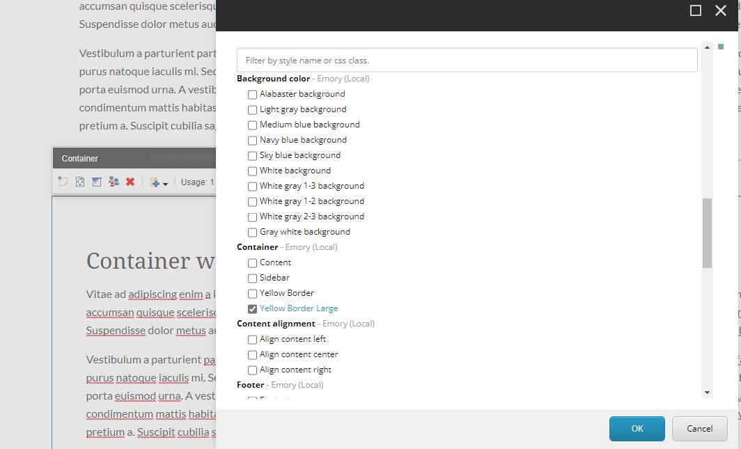
  • Container has a few Paint Bucket options:
    • Content - adds right padding, typically used on main content
    • Sidebar - adds right padding, typically used on sidebar
    • Yellow Border - adds top and bottom yellow border and spacing
    • Yellow Border Large - same as Yellow Border with larger spacing
  • An example of the component is shown HERE which has a sky-blue background color added from the Background color - Emory (Local) options.

Content Author Notes

1.  Containers are added to a page to define the page structure as well as styling and backgrounds.

2.  To place a container on a page, add a new item and select page structure- then container

3.  Once a container is placed on a page there are multiple variations such as adding yellow lines (as seen in the developer notes).  To select these variations use the paint bucket and select the style of container that you would like to use on the page.

Requirements

Containers:

  • The containers were built and designed to accommodate the different variations of components and styles. 
  • The CA would use Paint Buckets to add color or borders