- Component resides inside EH Navigation tab in the Toolbox by the name EH Link List.
- EH Link List is similar to the OOB SXA's Link List Component.
- Component has three variants - Default which is selected by default.
- Component on this page is Two Columns Link List variant
- To create a link list with yellow border, CA can utilize Container component with Yellow border options.
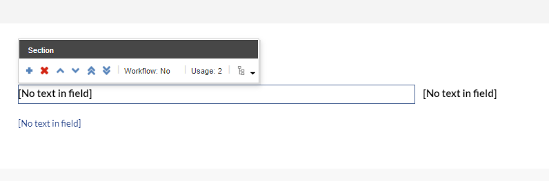
- The EH Link List component in a parent-child model where the parent(EH Link List item) has the heading for the List and its children, EH Link items, for the list of links.
- Applicable fields for EH Link List(parent) item:
- Title : single line text field to add heading.
- Applicable fields for EH Link (child) item:
- Link : link field to add links, the link text will be displayed on the website.
- Option to change the heading style is in the Rendering Parameters in the Title paragraph style field. By default, the list heading is a h3.
- CAs should note that whenever this component is added, it takes the entire width of the container. They can adjust/change the width using Grid Settings
- An example of the component is shown HERE.

Two Column Variant
Two Columns Link List
Two Columns Link List
Developer Notes
Content Author Notes
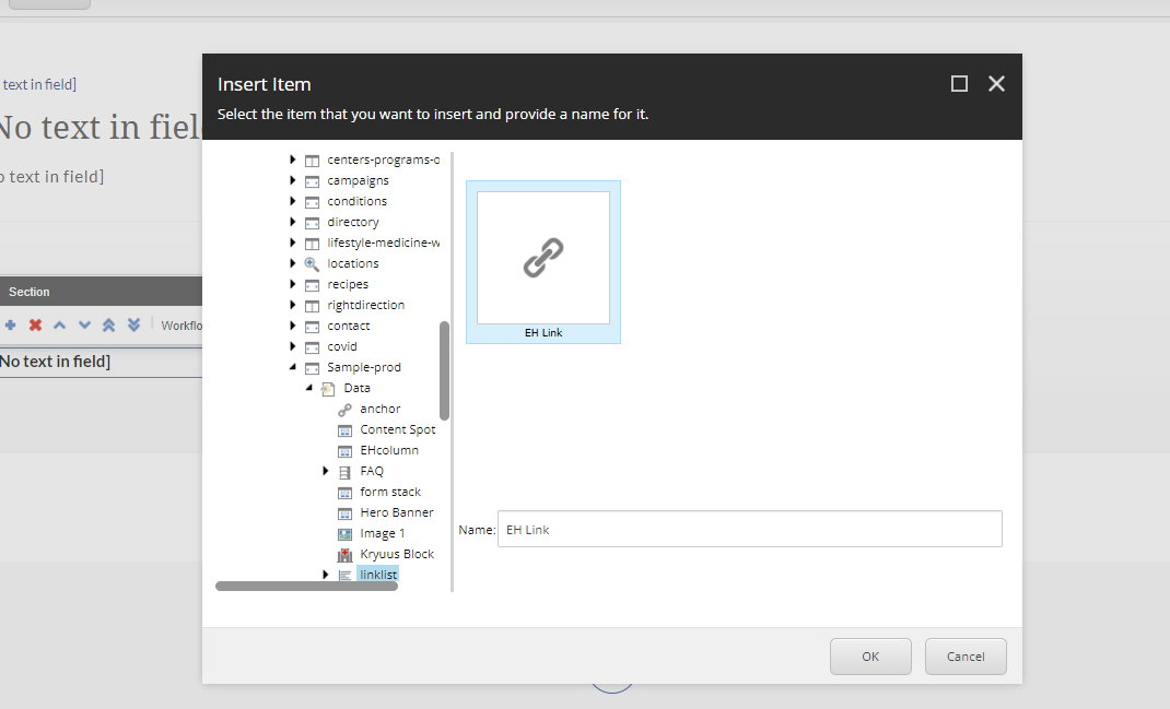
1. Click "Add Component" icon at the top of the page
2. Select the placement and pick the rendering "EH Link List" Under EH Navigation. Create and name the local data source.

3. Once the component is loaded, ensure the design view is enabled under View tab.
4. Click the Link List and change the variant to Two Column Link List

5. To update the title, click the placeholder text and update the title
6. To manage links, click the place holder text and click the link with a pencil icon

7. Once the link management window opens you will be able to manage the following:

- Link Description (Text)
- URL
- Target Window
- Style
- Alternate Text
8. To add links, click right next to the placeholder text. A dialog box will appear and you will be able to add a link. Click the addition icon.
9. A window will populate to create a data source for the link. Name the data source and save the changes.
10. Authors will be able to update grid settings and heading style of the link list with paint bucket settings.

11. Make sure to save and publish changes.
Requirements
Extended Link List- Two Column:
- The Two Column extended link list will use a container with the link list within.
- The link list should include the following elements:
- Title (Single line text)
- Links
- Heading Markdown Dropdown (No default required)
- H2
- H3
- H4
- The Link list will display in two columns, the 1st item will be on the top left, and the 2nd will be top right.
- For styling please see: Designs
- Link Style
- Yellow borders should be added via paint bucket on the container.
- The CA can opt to not have/use a border.
- On hover arrow extends.
- This component must follow accessibility standards for alt text, and keyboard navigation.
Mobile:
- Content is stacked, links will list in order from left to right.