- The component resides inside EH Navigation tab in the Toolbox by the name Icon Link List.
- The Icon Link List component is built using a parent-child model where the parent has the heading of the Icon Link List and child(ren) are the list of icon links.
-
Applicable fields of Icon Link List parent item:
- Title: Single link text field to add heading.
-
Applicable fields of Icon Link List child item:
- Link: A link field to add link properties of the icon link
- SVG Icon: Image field to set the image to be displayed.
- Icon Link List has one variant - default.
- The component will fill the whole width of the parent, therefore it's best to be added under the Section Container component.
- The Icon Link List has a white background by default, it's recommended to set the component under the Section Container component with a darker background color.
- An example of the component is shown HERE

Icon Link List
Resources and Information
Developer Notes
Content Author Notes
1. Open up EE and select the "Add component" icon
2. Select the placement and click "Add Here"
3. Pick the "Icon Link List" rendering under EH Navigation. Create a data source.
4. One the component loads, click the placeholder title text and add title.
5. select the image placeholder and click the add image icon. Select the icon from the media library.
6. Once the icon has loaded, select the link with the pencil icon to add a link
7. Fill out the following properties:

- Link Description
- URL
- Target Window
- Style
- Alternate Text
To Add An Icon Link
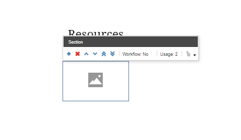
8. Ensure that the design view is enabled under view tab. Click the section space of the icon. You should see the following dialog box:
Hint: If you need, select the other icon link and select the parent component icon until you see the above dialog box. It will be titled "Section"
8. Click the addition icon and create a new data source. The new icon link will load.
Repeat 5 - 7.
To Delete An Icon Link
9. Ensure that the design view is enabled under view tab. Click the section space of the icon. You should see the following dialog box:
Hint: If you need, select the other icon link and select the parent component icon until you see the above dialog box. It will be titled "Section"
10. Click the deletion icon.
Authors will be able to manage the placement of the icons with this same dialog box. You will be able to do the following:
- Move Up
- Move Down
- Move First
- Move Last
Notes:
- It may be quicker for content authors to add the component to the page in EE and then manage slides/data sources in the Content Editor experience. You will be able to add, delete and move data sources more easily in this view.
Make sure to save and publish changes.
Requirements
Icon Link List:
- The Icon Link List can be used on any page and should allow up to 6 columns.
- The Icon Link List should include the following items:
- Title
- Tile
- Icon/Image
- Subtitle
- Link (internal/external)
- Minimum icons is 3 and max is 6
- Keep sizing the same if only 3 icons provided and center aligned.
- Use SVGS for icons
- This is a variant of the Link List used for socials within the footer.
- For styling please see: Designs
- The entire tile is clickable.
- This component must follow accessibility standards for alt text, and keyboard navigation.
Mobile:
- See requirements above
- When minimized in width, the columns will stack left to right into two columns.