- Image is an OOB SXA component.
- Component resides inside Media tab in the Toolbox by the name Image and Image (Reusable).
- The only difference between Image and Image(Reusable) is that when CA selects Image, the data-source item gets created automatically inside the page's local data folder, and in the case of Image (Reusable), the CA is given the option to create and choose the location of the data source item.
- Component has just one variant which is selected by default.
- Applicable fields:
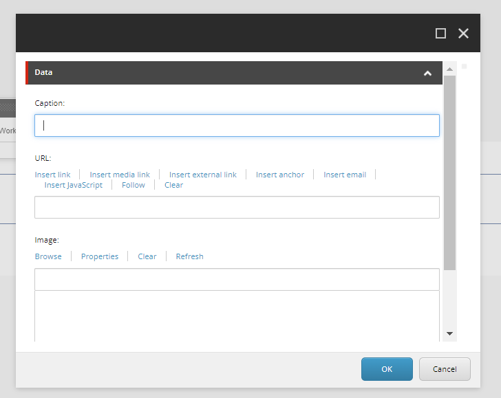
- Image: field to browse and select images from the media library.
- URL: field to add link to the image.
- Caption: field to add caption to the image.
- An example of the component, - image with no border and image with border and caption, is shown HERE.
- CAs have the ability to add a border to the image using the Paint Bucket Settings. All the available borders are listed in the Border - Emory(Local) section.
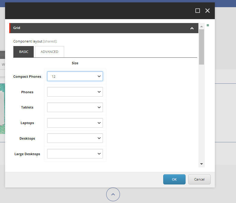
- CAs should note that whenever this component is added, it takes the entire width of the container. They can adjust/change the width using Grid Settings

Image
Developer Notes
Content Author Notes
1. Open up EE and click "Add Component" icon
2. Click "Add Here" and select the rendering Image under Media. Create a data source.
3. Once the component loads, select the following icon to edit the image
4. Once the window populates authors will be able to edit the following fields
5. Click Browse to open up the media library
6. If applicable authors can add a border or update grid settings with paint bucket settings
7. Save and publish changes.
Requirements
Image:
- The Image component adds an image that you select from the media library.
- The Image component should contain the following fields:
- Image
- Caption (plain text)
- Link
- CA would like the ability to add captions (optional) and it should be positioned bottom left.
- CA should be able to add a border to an image.
Mobile:
- Responsive


