emory-background

Header

Developer Notes

  • The Header will be displayed on all pages of the site at the top of the page.
  • The Header has been implemented using Partial Designs. It is located on/sitecore/content/EH/Emory/Presentation/Partial Designs/Header.
  • This partial is added to the Page Design.
  • Child menu items of mobile Primary Navigation added dynamically. CA only needs to add the parent items through the Primary Navigation component.

General Components Structure of the Header

  • Header Alert
  • Section Container with ID header-top-section
    • Container with ID top-header-left-section
      • Rich Text - Phone Link variant
      • EH Popup
    • Container with ID top-header-right-section
      • Heading Link list - Header Links variant
      • Search Box - Header variant
  • Section Container
    • Container with ID main-header-container
      • Image
      • Container with ID main-header-navigation-container--desktop
        • Primary Navigation
        • Link - Round Button variant
      • Container with ID main-header-navigation-container--mobile
        • Link with class mobile-search-btn
        • Link with class mobile-nav-btn
    • Container with ID mobile-search-panel
      • Search Box
    • Container with ID mobile-menu-panel
      • Container with ID mobile-utility-nav
        • Container
          • Rich Text
        • Container
          • EH Popup
      • Container
        • Container with ID navigation-mobile-wrapper
          • Container with ID navigation-mobile
            • Primary Navigation
        • Link - Round Button variant

Primary Navigation

  • Primary Navigation is a custom component based of out of the box Tab component
  • The parent menu item reside in the Heading of the Tabs
  • The child menu items reside in the Tab as Link List components
  • By default child menu items will be displayed at 8 rows maximum. This will result the four column layout when the menu items are between 25 and 31 items
  • If the child menu items is more than 31 items, it will be displayed on the next column resulting five columns layout.
  • In some instances where CA would like to reduce the 8 rows limit, CA can use Max row 5 option on the Link List component. This will reduce the max row to 5 row. For example: Patient & Visitors items.


Data Sources:

  • Primary Navigation Tabs (Includes Patient & Visitors + Centers & Programs drop down list) EH/Emory/Data/Link Lists/Header/Primary Navigation
  • Quick Links: EH/Data/Heading Link Lists/Header
  • Primary Navigation Tabs: EH/Emory/Data/Primary Navigation/Main Navigation
  • Additional Links: EH/Emory/Data/Links/Header Links
  • PopUp Connection: Eh/Emory/Data/EH PopUp Folder/HealthConnection 


Content Author Notes

Managing Header in Experience Editor

1. Navigate to Partial Designs under Presentation in the Content Tree

2. Open up Partial Design menu and right click "Header" to open up in Experience Editor 

3.Tabs are managed by Links or have a drop down menu managed by a Link List

desktop-header

4. To manage the individual links, ensure editing mode is enabled in View tab. click the click you would like to manage and open up link properties by clicking the link icon with a pencil.


5. To add links, ensure the design view is enabled under View tab. Click the around the Link list and a dialog box will open with the following options: 

  • Add Link
  • Delete Link
  • Move Up
  • Move Down
  • Move First
  • Move Last

6. PromoContent is managed by an RTE field. Authors can manage on the field or click the pencil icon to open up the RTE window. 

7. Logos are managed by image fields 

8. MyChartPortal button is managed by a link 

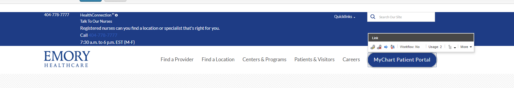
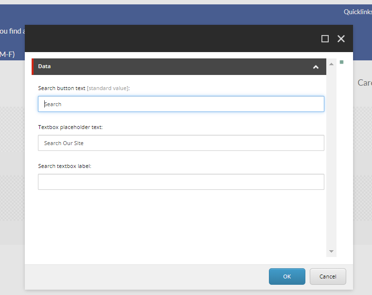
9. Authors can edit the search by managing the search box at top. Click the component and open up editing window by click the search settings icon 


10. Make to save and publish changes

Content Editor

You can manage the links under Centers & Programs + Patients and Visitors within the Content Editor as well The data source path for the main header links is the following: EH/Emory/Data/Link Lists/Header/Primary Navigation. For QuickLinks, the data source is located under EH/Emory/Data/Heading Link Lists/Header/QuickLinks

1. Navigate to the global data source "Link Lists"

2. Open Up Link Lists and the menu Header. There will be two options to manage - Primary Navigation and Quick Links 


To manage other sections of the Header in Content Editor, open up the Links global data source and there will be a folder for header links. Authors will manage Hamburger Menu, MyChart Patient Portal and Search from this window. Follow the same instructions as above. 


Requirements

Header:

  • The CA can edit via the page design level.
  • The Header should be displayed from every page on the website.
  • The Header will be implemented based on the new designed found here: Designs
  • The Header will contain the following elements:
    • Header Container
    • Click to Call
    • Informational Popup
    • Quick Link Menu
    • Search Box
      • Text inside of box-  "Search our Site"
    • Image Variant for logo (Links to home page)
    • 5 Link list (flyout nav) Max of 6
    • Button Link (My Portal)
  • The header will be semi hidden upon scroll. Wen the user scrolls down it will be hidden and upon scrolling up it will re-appear. 
  • Click to open on Flyout for the primary nav should show or hide mega menu.
  • Fly Out Nav Labels:
    • Find a Provider
    • Find a Location
    • Centers & Programs 
    • Patients & Visitors
    • Careers
    • MyChart Patient Portal
  • Styling should follow designs: Designs
    • Underline should appear upon hover on all clickable links
  • This component must follow accessibility standards for alt text, and keyboard navigation. 

Mobile:

  • See requirements above.
  • Upon load in mobile, only the following elements should be displayed.
    • Header logo image
    • Search box
    • Menu
  • Expanded Menu will display click to call and Health Connection text. (Popup will not display in mobile)
  • Expanded Menu will open to accordion, links will display tier 3 dropdown navigation. 
    • The Menu Button should convert to a close button with an X
  • The primary topic-based navigation will be a slide-down, opened using the main menu "hamburger" menu icon.
  • Quick links will display inside the mobile menu below the top navigation area. 
  • User can click on Quick links and links will appear in a list. 
  • The search name and icon turn into a toggle button to hide and show the search input area.
  • The button link (My Portal) will show in the mobile menu at the bottom below the Quick links.
  • A Back button should be displayed when the submenu is expanded. 
  • View All Link will display below the submenu links.
  • For Styling please see: Designs